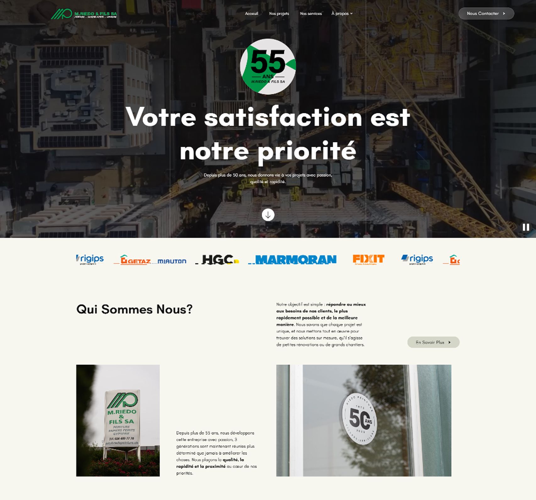
Riedo
04
Short
Description
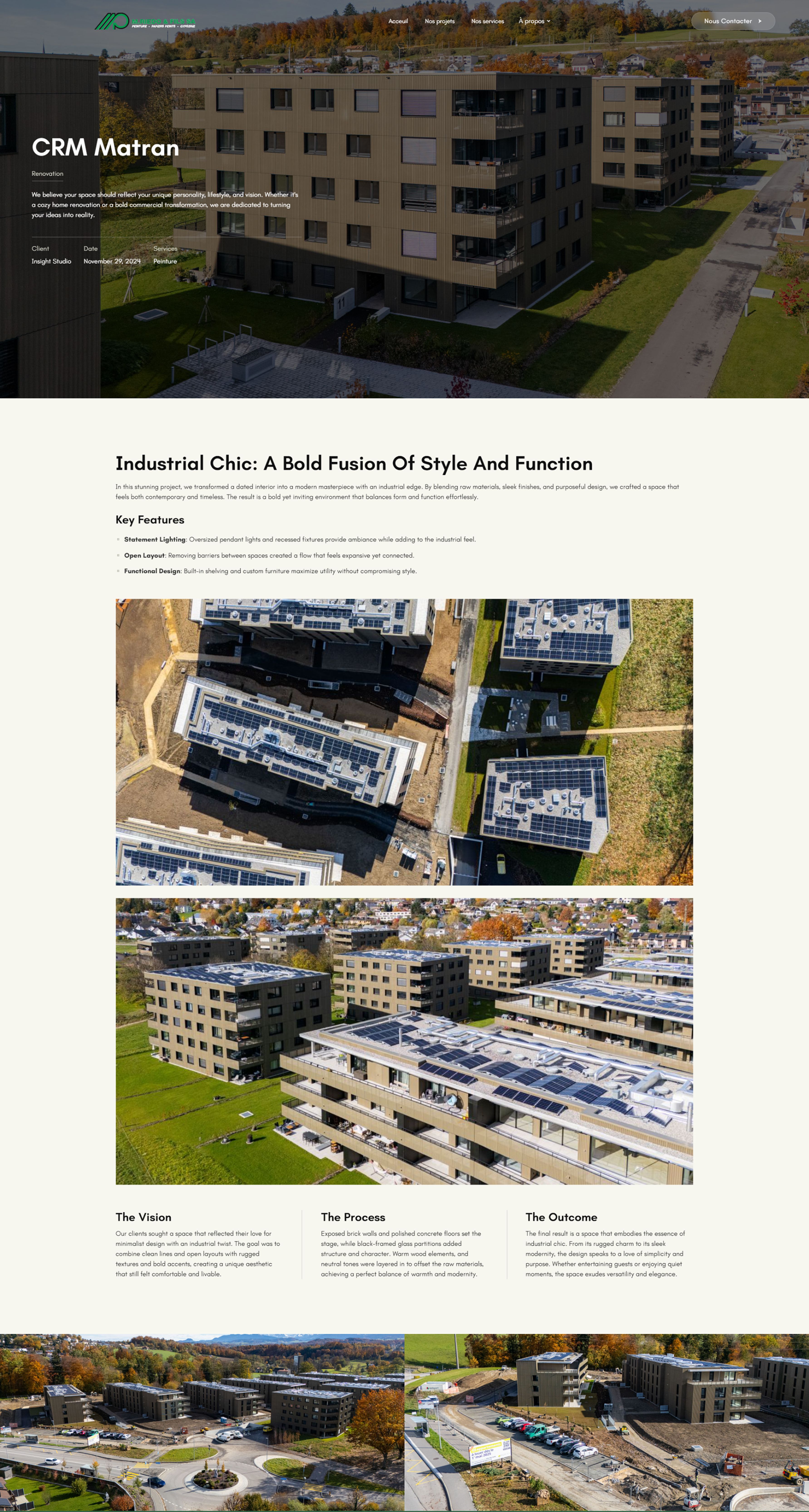
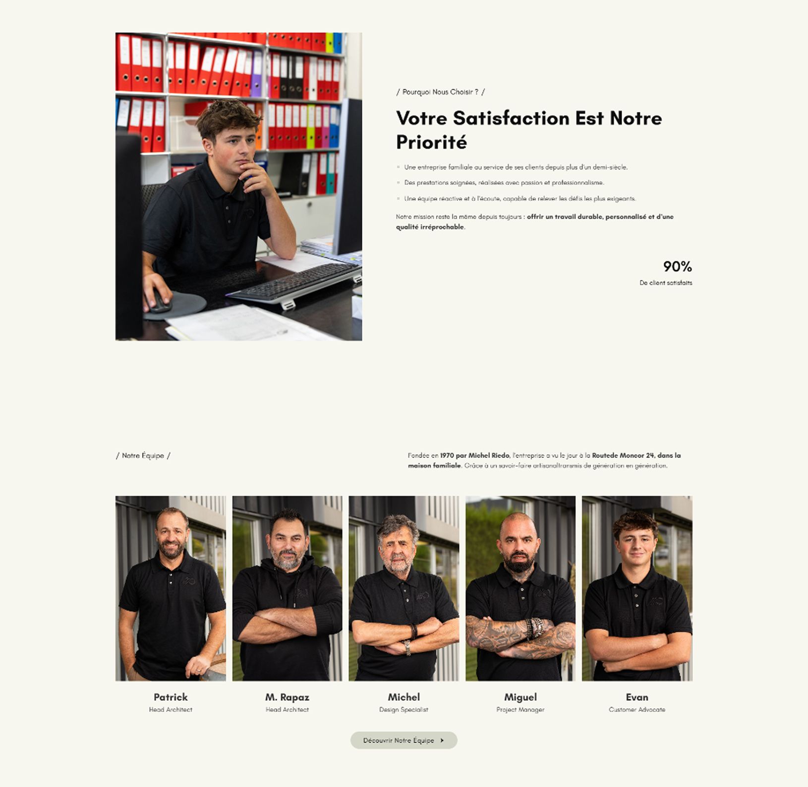
Riedo SA is a family-owned painting company operating in the construction sector for over 55 years. The goal of this project was to completely redesign their website by offering a fresher, more modern and reliable digital presence while maintaining the trust, professionalism, and heritage that define the company.
The Why
The previous website no longer reflected the scale and expertise of Riedo SA. As the company evolved, it needed a platform that could showcase its long-standing reputation, highlight the quality of its work and partnerships, and present its services in a clear, professional way. The challenge was to modernize the digital presence while preserving the authenticity and trust built over more than 55 years.
The How
I started by analysing Riedo SA’s core values quality, reliability, proximity, and efficiency and translating them into a clean, structured digital interface. The design relies on generous white space, a warm neutral color palette, and subtle animations to bring modernity while maintaining a professional and trustworthy tone. The result is a refreshed platform that strengthens Riedo SA’s digital presence while respecting its heritage. The new website positions the company as a reliable and modern construction partner, capable of evolving with the industry without losing its core identity.